Hi, and welcome to the first video as part of the OFS Analytics user guide.
Hi, and welcome to the first video as part of the OFS Analytics user guide.
In this video I'm going to take you through the basics of navigating your way around analytics.
Before we get started, it's important to note that each user with access to analytics has their own individual login credentials that are specific to them.
Don't forget, there is no limit to how many users can be set up in OFS, so make sure all those that should have access to OFS data are set up accordingly.
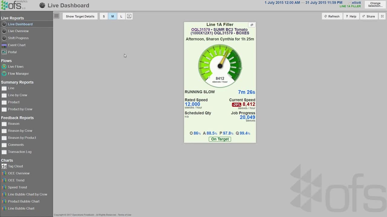
OFS Analytics is where all the information collected by OFS can be displayed in a wide variety of reports and charts, which you can see on the left-hand menu.
We'll go into these in more detail in later videos, but to give you a brief rundown we have live reports, summary reports, feedback reports, and some assorted charts at the bottom.
In order to give you more room to display your reports, this menu can be hidden by clicking here.
Let's start by opening up the change selection menu, which can be accessed by clicking here or here.
Here is another view presenting all the different reports and charts that are available to you in the OFS Analytics reporting suite.
Before you look at a report, however, you need to select the data you want to look at.
First of all, we'll select the lines we want to see. On this screen you can see all of your lines from all of your sites around the world.
For the purpose of this video, let's select lines 1A, 2A, and 3A filler.
Here you can select the date range of the data you want to see.
Let's say, for example, you want to look at data for the month of June 2015.
You would simply select it like so.
Here you have some useful calendar shortcuts, so for example, you can quickly configure Analytics to show you data from the past day or past week.
There are also a number of other options to choose from.
Here you can change the background theme of Analytics, selecting either a light background, which might be better suited to a brightly lit office, or a dark background, which might work better for the lighting on the production floor.
You can also choose whether or not to display descriptions for each report, showing a summary of what the report is used for.
These can be useful for those of you who are new to the OFS Analytics module.
As you can see, there are also a variety of other options you can configure to tailor the OFS Analytics experience to your specific needs.
The functions of these options are covered in other tutorial videos.
For more detail on the carousel settings here, check out the video on the live dashboard, and for more information about the different OE variants, watch the KPIs in OFS video.
Lastly, on the chain selection menu, you can adjust the date language and date format to whatever you're most comfortable with.
So that covers the chain selection menu, which will enable you to navigate confidently around Analytics.
Now, if you need to refer back to the terminology in the reports, then simply click the Help button here, and it provides definitions for the various metrics and KPIs available in the report you're looking at.
That's all for this video on general navigation in OFS Analytics.
Thanks for watching, and be sure to check out the rest of the OFS training videos that cover other areas of Analytics, as well as the other OFS modules.